Introduction
The Australian federal government raises and spends over $400 billion every year. It can be difficult for the average Australian to gain a handle on how this revenue is raised, and more importantly, to understand how it is spent. While Budget information is published annually in Portfolio Budget Statements, there is little that ties these publications together and allows for a “birds-eye-view” of government income and expenditure. To make matters more difficult, these publications:
- are in .docx or .pdf format of up to 600 pages per portfolio,
- have important financial tables as images needing Optical Character Recognition which is never perfect,
- allow apparent arbitrary merging of table cells,
- do not follow an exact standard format.
The companion database website PublicKnowledge.com.au has been developed with the help of an ACT Government grant and serves as a convenient way of ordering, searching and making sense of the vast complexity of the Australian Government Budget. The database currently encompasses the 2014 and 2015 Budgets. It is hoped that the work will find a wide audience and become an ongoing resource that enhances public understanding and interest in the workings of Government.
Discussion
This blog highlights ways the data can be accessed, interpreted and used to enhance understanding of government and to stimulate discussion. Each post will aim to raise an issue, refer to relevant data and provide an opportunity for discussion via the comments section. Appendices holding background information or more lengthy rationales will be interspersed in the text. Comments can also be made in each Appendix. Charts and Tables have been developed from Budget data in PublicKnowledge.com.au and clicking on them links into the relevant section of the database.
Welcome. Let’s start with a wide-angle lens.
The Budget in a Nutshell
This first post gives an overview of revenue and expenses published in the 2014 and 2015 Budget Statements and gives a brief lesson in how to explore the database.
Once expense categories have been established, summary data may be presented in bar graph format like that below, giving a bird’s eye view.
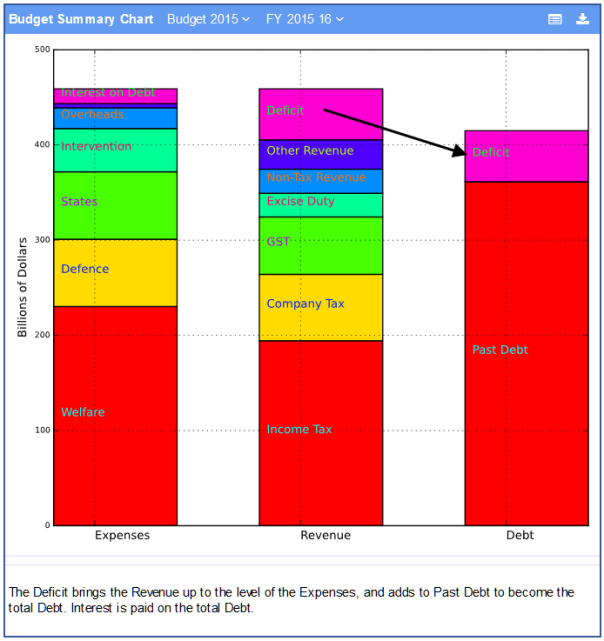
- The term Intervention covers Registration, Regulation, Standards, Subsidies and Special Interests of various types and includes Research, Environmental and Intervention in various market sectors of the economy.
- The money for Expenses must come from somewhere, if not from Revenue then from borrowings which is called the Deficit.
- The bars for Expense and Revenue must be the same height. The Debt bar is made up of the debt from past years plus the Deficit from this year’s budget.
- While Expenses and Revenue bars must be the same height, the Debt bar could potentially grow to exceed the budget Revenue as it does in USA and Japan.
- Interest must be paid on the Treasury Bonds that comprise the Debt and that Interest appears in the Expenses.
Quantitative Observations:
- Expenses ($469B) exceed revenue ($405B) giving a Deficit of $64B (billion) .
- The accumulated debt is approaching the size of the full budget expenses and growing at 13% pa
- Interest on the debt is about $15B or 3.4% of total expenses.
Budget Revenue
Appendix: Origin of Revenue Categories
Revenue is relatively easy to categorise and can be easily understood in the following pie chart:

- The Deficit has been included so that the Revenue face of the pie is equal to the Expense face.
- There were 9 other minor Revenue categories that were too small to show and label clearly. Each was less than 4% of total revenue.
Budget Revenue Detail
The revenue categories can be explored in the database by opening and closing categories, selecting a different budget or time points. Clicking on the following table shows it in the database with all phrases live. Different Time Points (Years) can be selected and explanatory text can be included.
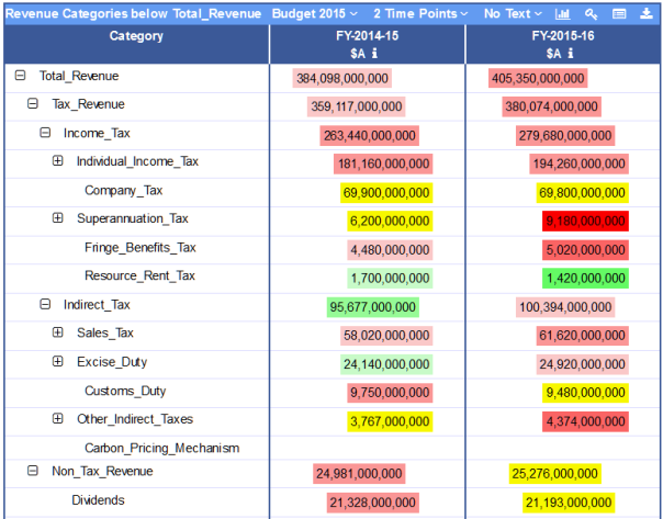
- The red values have gone up since the previous year in the same budget while the green values have gone down.
- Numbers whose right edge is indented compared to the number above are subordinate numbers. The total of all the subordinates should equal the superior number.
- Clicking on the table image will access the same table in the database where sections can be expanded or contracted by clicking on the [+] or [-] icons.
Appendix: Accuracy of Revenue Forecasts
Budget Expenses
These Expense Categories are unique to this blog and database. Each of the 500+ budget programs was assigned to a category based upon the text in the Portfolio Budget Statements.
Appendix: Origin of Expense Categories
The following table lists the primary Expense Categories and the definitions which controlled the allocation of programs to Expense Categories.

The following pie chart shows how the 2015 Budget spends the Revenue. Health and Education are included in the wide definition of Welfare as they are free or subsidised services provided to individuals.
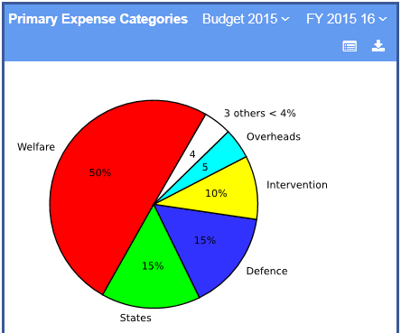
Notes on the chart:
- The Deficit has been included so that the Revenue face of the pie is equal to the Expense face. The Deficit can now be compared with the major revenue streams.
Going to Subjects, Activities, Expense Categories in the database allows exploration of the lower categories and the Programs that have been assigned to them. Please comment on anything you disagree with.

The Budget Pie
The Expense Categories can now be directly compared to the Revenue Categories as both pie charts represent the same amount of money.

Some simplistic comparisons:
- Welfare in the widest sense approximates Income Tax and the Deficit
- Defence is approximately covered by Company Tax
- The States consume the GST and a bit more
- The Deficit cannot be removed by small changes to minor revenue streams.
How did the Deficit start?
Published Budget Statements give easy access to revenue and debt back to 2000. Currently expense data is taken only from the Portfolio Budget Statements which require much effort to process. Past budget total expenses have been approximated as follows:
- This year’s Debt minus last year’s Debt gives this year’s Deficit.
- This year’s Revenue plus this year’s Deficit gives this year’s Expenses.

- The 7% pa line has been included to show the approximate growth rate of Revenue and Expenses
- The Global Financial Crisis caused a sudden drop in revenue but only a small drop in expenses.
- Growth in revenue soon returned to its former levels but so did growth in expenses.
- The Deficit has not been reduced since then and the Debt has continued to climb.
Appendix: Risk from interest rate rise (Treasury Bonds)
Appendix: OECD Tax Rates
Budget Revenue growth exceeds that of GDP
Fig 8 above shows that Budget Revenue and Expenses are both growing at about 7% per year. However, Gross Domestic Product (GDP) is growing at less than 3% per year which could be a problem.
To investigate this, GDP was sourced from the Reserve Bank. This source provided an explanation of GDP.
Gross Domestic Product (GDP), as measured by the final value of all goods and services produced within a country, is the basic measure of a nation’s economic output.
Disaggregated into its components, GDP is the sum of the value of private sector consumption and investment goods (C+I), public sector consumption and investment goods (G) and net exports (X – M): Y = C + G + I + X – M
The new term Private Sector Product (PSP) is now defined as GDP without the public sector consumption and investment goods (G).
- Term Y, the GDP, in relative terms is 100%
- State and local revenue is about 23% of federal revenue. So term G is approximated by 1.23 X Federal Budget Revenue.
- Net exports (X-M) have not been included as they have generally been < 1% GDP for the last few years.
- Private Sector Product (C+I) is being approximated as 100% – 1.23 X Federal Budget Revenue % of GDP.

- GDP has grown at about 3% pa.
- Budget revenue at about 7% pa.
- Private Sector Product at about 1.7% pa.
A National Tax Rate
Knowing what the private sector produces (PSP) and how much of that is taken as Budget Revenue, a National Tax Rate can be calculated for each year.

This National Tax Rate has grown from about 22% in 2001 to about 45% in 2015. Presumably some of this is bracket creep in Income Tax. If this continues for another 4 year parliamentary term at a growth rate of say 5% pa then the 45% will increase to almost 55%. In another 4 years it would reach 67%.
The Private Sector would presumably collapse well before the 100% figure when Budget Revenue consumed all of the Private Sector Product.
A Financially Sustainable Economy
This would have:
- a balanced budget so sovereign debt is not increased,
- no sovereign debt so no revenue goes on interest,
- a National Tax Rate that is not increasing.
Future postings are planned on
- Welfare in the 2015 budget
- Defence in the 2015 budget
- Infrastructure in the 2015 budget
- Overheads in the 2015 budget
- Justice in the 2015 budget
- Intervention in the 2015 budget
Discussion
This post is trying to encourage a structured discussion on the budget Deficit and consequential Debt. Some relevant information has been provided in order to give an understanding of the issue. There will be an opportunity to discuss each Expense Category in detail in later posts. You can comment on the Appendix links individually.
Some rather glib topics to start discussion:
- Do we leave future generations with sovereign debt or sovereign wealth?
- What is a reasonable maximum National Tax Rate?
- Update: There were more glib topics but they have been removed.
These topics have been “seeded” into the comments. The blog has been configured to allow considerable nesting of comments, so please reply carefully with a short paragraph or two with a link or two where appropriate. I intend to copy a moderated version of the eventual comment tree into this posting itself.
